Pie Chart IELTS Sample – Tổng hợp Bài mẫu IELTS Writing Task 1 Pie Chart hay nhất
IELTS Writing task 1 Pie chart là một trong những dạng thi phổ biến nhất trong IELTS Writing task 1. Ngoài việc tự luyện viết hoặc chấm chữa, một cách tăng band điểm nhanh chóng là tham khảo các bài viết mẫu Writing Pie chart IELTS sample. Bằng cách này, người học có thể hình dung được cách tổ chức ý tưởng diễn đạt, cách chọn lọc từ vựng, cấu trúc ngữ pháp sao cho cho phù hợp và hiệu quả, Hãy cùng tham khảo các bài mẫu mà IELTS Test Pro đã tổng hợp dưới đây nhé!
Bên cạnh đó, IELTS Test Pro đã có hướng dẫn viết IELTS Writing task 1 Pie chart rất đầy đủ và chi tiết, các bạn đừng bỏ lỡ!

1. Pie chart IELTS sample 01
Đề bài: The pie chart gives information on the proportion of carbohydrates, protein and fat in three different diets. Write a report for a university lecturer describing the information shown below. Make comparisons where relevant. You should write at least 150 words.
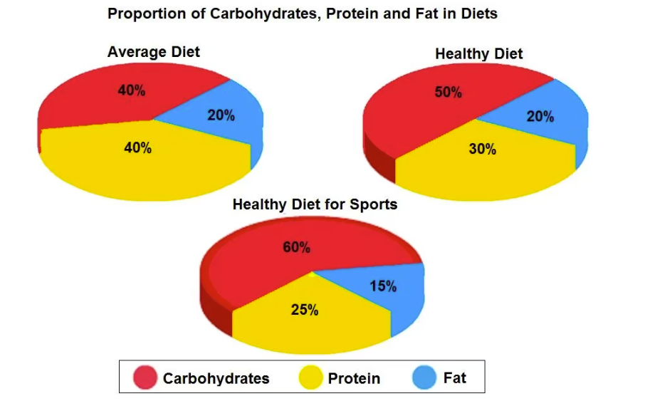
Sample answer
The pie charts compare the amount of electricity produced using five different sources of fuel in two countries over two separate years.
Total electricity production increased dramatically from 1980 to 2000 in both Australia and France. While the totals for both countries were similar, there were big differences in the fuel sources used.
Coal was used to produce 50 of the total 100 units of electricity in Australia in 1980, rising to 130 out of 170 units in 2000. By contrast, nuclear power became the most important fuel source in France in 2000, producing almost 75% of the country’s electricity.
Australia depended on hydropower for just under 25% of its electricity in both years, but the amount of electricity produced using this type of power fell from 5 to only 2 units in France. Oil, on the other hand, remained a relatively important fuel source in France, but its use declined in Australia. Both countries relied on natural gas for electricity production significantly more in 1980 than in 2000.
(170 words)
2. Pie chart IELTS sample 02
Đề bài: The pie charts indicate changes in the proportions of energy produced in a country from 1983 to 2003.
Sample answer
Summarize the information by selecting and reporting the main features, and make comparisons where relevant.
The given pie charts depict data regarding the percentage of energy generated from five different sources (Hydropower, Oil, Nuclear power, Coal, Natural Gas) in a particular country between 1983 and 2003.
In general, it is clear that oil was the most popular source of energy in both years despite a slight decrease. In addition, this country also relied more on using nuclear power and natural gas by 2003.
To begin with, in 1983, oil and coal were used to produce 42% and 23% of the total energy, respectively. Over the next 20 years, the proportion of energy produced from oil saw a slight decline by 4%, while energy from coal also reduced by 10%.
In contrast, there was a reverse pattern in both figures for nuclear power and natural gas, which increased by 4% and 10% respectively to collectively surpass the percentage of energy generated from coal. On the other hand, hydropower was responsible for only 4% of energy produced in both years.
(163 words)
3. Pie chart IELTS sample 03
Đề bài: The pie charts below show how dangerous waste products are dealt with in three countries.
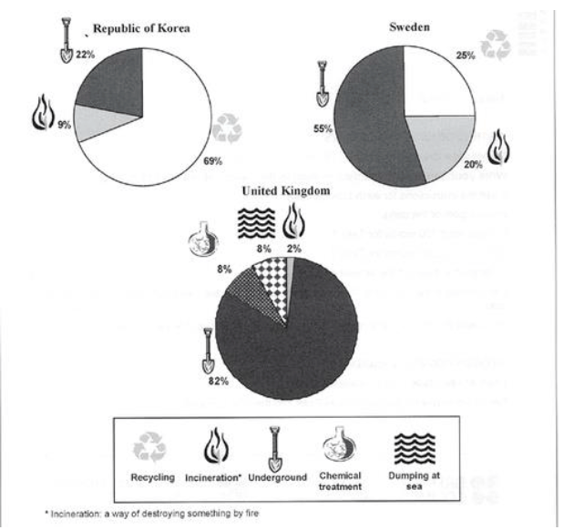
Sample answer
The charts compare Korea, Sweden and the UK in terms of the methods used in each country to dispose of harmful waste.
It is clear that in both the UK and Sweden, the majority of dangerous waste products are buried underground. By contrast, most hazardous materials in the Republic of Korea are recycled.
Looking at the information in more detail, we can see that 82% of the UK’s dangerous waste is put into landfill sites. This disposal technique is used for 55% of the harmful waste in Sweden and only 22% of similar waste in Korea. The latter country recycles 69% of hazardous materials, which is far more than the other two nations.
While 25% of Sweden’s dangerous waste is recycled, the UK does not recycle at all. Instead, it dumps waste at sea or treats it chemically. These two methods are not employed in Korea or Sweden, which favour incineration for 9% and 20% of dangerous waste respectively.
(159 words)
4. Pie chart IELTS sample 04
Đề bài: The pie charts below compare water usage in San Diego, California and the rest of the world.
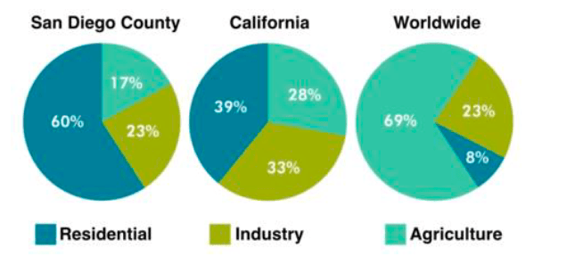
Sample answer
The pie charts give information about the water used for residential, industrial and agricultural purposes in San Diego County, California, and the world as a whole.
It is noticeable that more water is consumed by homes than by industry or agriculture in the two American regions. By contrast, agriculture accounts for the vast majority of water used worldwide.
In San Diego County and California State, residential water consumption accounts for 60% and 39% of total water usage. By contrast, a mere 8% of the water used globally goes to homes. The opposite trend can be seen when we look at water consumption for agriculture. This accounts for a massive 69% of global water use, but only 17% and 28% of water usage in San Diego and California respectively.
Such dramatic differences are not seen when we compare the figures for industrial water use. The same proportion of water (23%) is used by industry in San Diego and worldwide, while the figure for California is 10% higher, at 33%.
(168 words)
5. Pie chart IELTS sample 05
Đề bài: The charts show the sources of electricity produced in 4 countries between 2003 and 2028. Summarise the information by selecting and reporting the main features, and make comparisons where relevant.
Sample answer
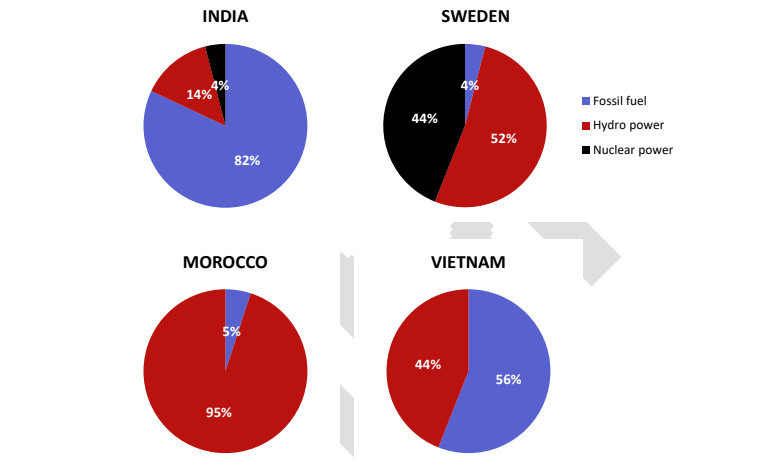
The given pie charts detail information about the proportion of three different sources of electricity in four countries (India, Sweden, Morocco and Vietnam) from 2003 to 2008.
Overall, Vietnam and Morocco did not use any nuclear power for electricity production. It can also be seen that while fossil fuels were the largest source of electricity supply in Vietnam and India, they only occupied a relatively marginal proportion in Morocco and Sweden during the examined years.
In Vietnam, 56% of the total amount of electricity was produced from fossil fuels, while the figure for Morocco was only 5%. The rest of the electricity, in both nations, was produced solely from hydro power.
In India however, electricity from fossil fuels contributed to 82% of the entire quantity of electricity produced, which was also the highest figure for fossil fuel use among the four countries. Meanwhile, fossil fuels were only responsible for 4% of the total generated electricity in Sweden, with hydro power and nuclear power contributing 52% and 44% respectively.
6. Pie chart IELTS sample 06
Đề bài: The chart below shows the results of a survey of people who visited four types of tourist attraction in Britain in the year 1999.
Sample answer
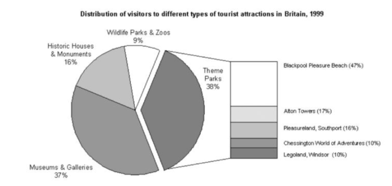
The pie chart compares figures for visitors to four categories of tourist attraction and to five different theme parks in Britain in 1999.
It is clear that theme parks and museums / galleries were the two most popular types of tourist attraction in that year. Blackpool Pleasure Beach received by far the highest proportion of visitors in the theme park sector.
Looking at the information in more detail, we can see that 38% of the surveyed visitors went to a theme park, and 37% of them went to a museum or gallery. By contrast, historic houses and monuments were visited by only 16% of the sample, while wildlife parks and zoos were the least popular of the four types of tourist attraction, with only 9% of visitors.
In the theme park sector, almost half of the people surveyed (47%) had been to Blackpool Pleasure Beach. Alton Towers was the second most popular amusement park, with 17% of the sample, followed by Pleasureland in Southport, with 16%. Finally, Chessington World of Adventures and Legoland Windsor had each welcomed 10% of the surveyed visitors.
(181 words)
7. Pie chart IELTS sample 07
Đề bài: The charts below show the proportion of people’s total spending in a particular European country was spent on different commodities and services in 1958 and in 2008.
Sample answer
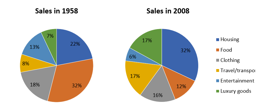
The pie charts detail the proportion of people’s total expenditure on six different goods and services (housing, clothing, entertainment, food, travel/transport, and luxury goods), in a European country, in 1958 and 2008.
It is clear from the charts that spending in all aspects, except clothing, changed quite substantially over the fifty year period
In 1958, people spent the largest portion of their spending on food, at 32%. The two other categories that took up the majority of people’s money were housing, at 22%, and clothing at 18%. Entertainment, travel/transport and luxury goods only comprised around a quarter of all spending at 18%, 8% and &% respectively.
50 years later spending changed quite significantly with housing now becoming the biggest expense and taking up almost one third of total spending, at 32%. The expenditure on clothing, transport/travel and luxury goods all increased and all took up around 16-17% of the total spending. The expenditure on food dropped significantly to 12%, while entertainment costs were only half of that.
Trên đây là tổng hợp một số IELTS Writing pie chart sample để hỗ trợ các bạn học IELTS có thể dễ dàng tham khảo, định hướng và rút kinh nghiệm khi làm bài viết của mình. Chúc các bạn có một kì thi IELTS thuận lợi và đạt kết quả cao nhất! Đừng quên Luyện thi IELTS Online miễn phí mỗi ngày cùng IELTS Test Pro nhé!